Showing posts with label assignment 3. Show all posts

Wednesday, 27 July 2011

Assignment 3 - rethink

Further thought on the colours assignments.
I am again trying to be too clever and not direct enough.
Points to remember:
  1. answer the question
  2. be as clear as possible
  3. look for an interesting/unusual angle
  4. explain ones thoughts and processes clearly.

 Complimentary colours - yellow and violet:


Railcar Door - Violet and Yellow. ISO 200, f/10, 102mm efl, 1/80 sec.


This was the original - the one below I have changed the door to a more obvious violet by using a different RAW conversion in Lightroom 2 and adding it as an extra layer to the original image to brighten and lighten the violet.


Railcar Door 2 - Violet and Yellow. ISO 200, f/10, 102mm efl, 1/80 sec.


This shows a much clearer violet / yellow contrast. The alteration in processing has been effective without loosing the bright yellow. The yellow remains the smaller proportion, but its brightness makes it stand out.


Accented colours
 
Two extra (and probably clearer) options for single colour accents.

Red on blue door. ISO 100, f/9, 70mm efl, 1/50 sec


This is a door of an old railway carriage. Very dilapidated and clearly 'patched up'. The red really stood out and makes the image much more interesting.


Red on yellow carriage side. ISO 100, f/10, 86mm efl, 1/500 sec.


A small rectangle of intense red livens the image and draws the eye


Very small red accent on a striking yellow background.


 The red contrasing colour stands out againt the background


On the same subject of small points of colour against a background, I came against this scene when exploring an old graveyard. 
 
Deserted and decayed. ISO 320, e/5.3, 60mm efl, 1/40 sec.


Red and broken gravestones pointed up by the intense blue of a piece of modern plastic waste.


Similar colours:

These needed to be more clearcut and show more definate colours.

Blue and green. ISO160, f/13, 46mm efl, 1/200 sec


Green hills against a blue (ish) sky, with some added storm clouds. A very Scottish picture.


           Blue and green ISO 100, 90mm efl, f/3.5, 1/80 sec

The back of the flower is a very intense blue which really stands out against the much more muted green foliage. The green is, however, emphasised by the bright green stalk leading into the centre of the flower, surrounded by an almost white area.


 Although the more intense blue looks as though it is a much larger area of colour it is not. The effect is given by the central placing and the colour intensity.


For the next image of similar colours I had intended to shoot raspberries, strawberries and blueberries - but my children have eaten them! I need to think again - or go shopping again.

ISO 1600, 84mm efl, f/5.6, 1/8 sec


An almost even balance of luscious red and purple berries. The colour points up the desirability of these fruits. There is slightly more of the brighter red - but this is balanced by the more central position of the purple blueberries.


 It is difficult to analyse this image as the colours are mixed - not in a single block.The fruit that stands out most clearly is the slightly incomplete raspberry at the top which is balanced on the blueberries. The position and colour makes me want to eat it first.

Saturday, 16 July 2011

Assignment 3 - part 4

Colour harmony though similar colours.

Similar colours are those next to each other on the colour wheel and images made with these are often tranquil and soothing, rather than vibrant.

Example 1.

A peaceful day on the loch. The main colour visible for a long range picture is blue.

Lake of Menteith - blue and green harmony. ISO 100, f/5.6, 72mm efl, 1/1000 sec


A very tranquil scene with a large area of blue divided by a small band of green, which gives interest to the image.


Example 2.

Close to the shore the main colour becomes green, with the green also being reflected in the water.Still  a tranquil scene - but very different.

Sores of Menteith -green and blue. ISO 100, f/5.6, 50mm efl, 1/640 sec.


Small bands of blue shows at the top and bottom of the image These need to be enhanced with a filter, as the exposure contrast was so great that all colour would have been washed out of the sky if the green was correctly exposed. ideally this could have been done in camera with a neutral grad filter in place, but was actually done post -processing in Lightroom 2.


Example 3. 

A pile of vibrant and tasty peppers, polished and ready to eat.


Peppers. ISO 400, f/7.1, 156 efl, 1/40 sec


The balance is uneven, with a smaller amount of green to the highly saturated yellow, and, even though these colours are next to each other on the wheel they appear  as contrasting here.


Example 4.

Sweets on a market stall. Loaded with colourants, but highly attractive to young eyes.

Enticing?  ISO 100, f/9, 90mm efl, 1/100 sec.


The colours are evenly balanced, and mimicked in the trays of sweets to the back and the sides. The surrounding papers act a barrier and help emphasise the intensity of the colours against the pale cream.

Assignment 3 - part 3

Colour Accent.

The purpose here is to show how colour can work as an accent, using a small amount of colour against a background of another. This is the effect that catches ones eye to something in the distance, such as the red house roof against the fields (which I saw - but haven't managed to go back to photo because of endless rain), or the expensive item in the shop window!

Example 1.

Foxglove on a hill, the brilliant violet stands out against the green.

Foxglove - violet point on green. ISO125, f/13, 90mm efl, 1/60 sec


A single accent, a line rather than a point of intense colour which really stands out, a complete contrast of colour.


Example 2.

A flag flying on the shore at the edge of a broken and deserted pier. Who keeps it there and why? Is it a warning, and if so - of what.  This is full tide, so the pier is never covered.

Only the flag remains. - red on blue. ISO 100, f/10, 90mm efl, 1/200 sec


A very intense red on a background of blue dominates the whole scene. The colours contrast both in their place on the colour wheel and in their intensity, with the blue a much more subdued hue.


Example 3. 

This year all the fields of rape are full of poppies - remembrance of an old way of farming?


Poppy. ISO 400, f/5.6, 400mm efl, 1/125 sec.


The single point becomes the whole purpose of the image, partly because of the contrasting yellow colour and partly because of the depth of field.


Example 4.

An arrangement of beads and threads , all violets (although some very pale in saturation, set of by a vibrant yellow jade figurine.

Glass and Jade - yellow on violet. ISO 400, f/22, 90mm efl, 4 sec


The yellow of the figurine is magnified by the background of its complementary colour violet in the cloth and the beads.

Wednesday, 13 July 2011

Assignment 3 - part 2

Colour contrast though contrasting colours.

The aim here is to demonstrate how contrasting colours work, that is using colours a third of the way around the colour wheel such as yellow and red or purple and green.

Example 1.

This is the superstructure of a boat in Aberdeen Harbour. It was brilliant sunshine and the sky dark blue. The contrast was stunning.


Superstructure - yellow and blue. ISO 100, f/5.6, 144mm efl, 1/160 sec


The bright yellow is more intense than the blue and even though there is less of it the yellow dominates the image. The eye is drawn by the mass of yellow at the bottom and then moves upward along the mast.


The balance is off centre and there is a definite tension in the picture, which adds interest.


Example 2.

Although this looks like a still life set up it is actually hand-made soaps arranged in heaps on a market stall.

Soaps - red and yellow. ISO 400, f/7.1, 400mm efl, 1/25 sec.


Here there is nearly the same amount of the 2 contrasting colours, however the increased saturation of the reds when compared with the yellows makes them stand out and emphasises their position at the front.


The balance of the colours is nearly equal and gives a strong contrast.


Example 3.

In this picture the background plants were really a greenish-yellow and a filter was used in photoshop to make them appear more yellow and give a greater contrast. The leaves are usually seen as a more brownish red, but on this occasion the sun was directly shining on the and partially though them causing the intense colour.

Garden Colour - red and yellow. ISO100, f/5.7, 90mm efl, 1/100 sec.


There is less red than yellow here but its greater saturation makes it stand out from the background. The is helped by the depth of field giving a blurred effect. The eye is drawn into the picture and then up along the stalk of the plant to the delicate flowers.


The balance is only slightly off centre.


Example 4.

The deeply coloured foxglove stands out against the much softer greens.

Foxglove - violet and green. ISO 125, f/13, 60mm efl, 1/40 sec.


The intensity of the much smaller amount of violet contrasts strongly with the greens. The curve of the colour draws the eye though the picture from upper left to lower right.


The balance is very one sided and the contrast in intense however this makes an effective image.


 Example 5.

This fabulous poppy shows an intense orange centered with violet (contrasting colour or colour accent?)

Poppy - violet and orange. 


A central area of cool violet contrasts against the orange and gives a resting place.


The violet area is almost in the centre, and although a much smaller area and a less intense colour forms the main focus of the image.

Tuesday, 12 July 2011

Assignment 3 - part 1

This whole assignment is to look at colour relationships and the balance and tension they produce in a photograph. I found this assignment particularly difficult as while I often take pictures with a view to a monochrome conversion I found that I was not consciously considering colours for themselves. I also found that many of my images tend to have a medley of colours, rather than 2 contrasting or similar colours.

Colour harmony though complementary colours.

Example 1.

Edzell Castle near Dundee, the stone really is this vibrant orange and on a sunny day it is a stunning sight. The is also a large, mainly green, formal garden, which emphasises the colours even more.

Edzell Castle - blue and orange. ISO 100, f/14, 44mm efl, 1/60 sec


 This image is made from the complementary colours blue and orange. There is close to the desired ratio of 1 orange to 2 blue, however the blue is a more intense colour than the orange. This is balanced by the orange being in the lower part of the image which gives it more visual weight.


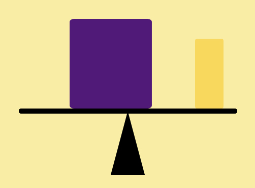
This is a diagram of the relative weights and positions of the colours.


Example 2. 

These scarves were seen hanging over a post in a street market.

Scarves in a Market - red and green.  ISO 400, f/6.3, 310mm efl, 1/40 sec.


Green and red is present here in almost equal amounts, together with a small amount of an almost neutral brown. The eye first looks at the light green, then is led across the image by the more vibrant red to the bottom darker corner.
  Here the weight of the colours are almost equal.                                                              
Example 3.

This close up detail of a door of an old railway carriage has been altered using digital filters.  The original colour was slightly more pink and the lock was originally a  more creamy yellow rather than the vibrant colour shown here. The original was pleasant but less effective than the altered version.

Railcar Door - Violet and Yellow. ISO 200, f/10, 102mm efl, 1/80 sec.


The colour ratio here again follows the ideal of about 1 yellow to 3 violet. The lock forms the shape of an arrow which pulls the eye into and down across the page. The balance here is significantly in favour of the violet in terms of mass but is counteracted by the saturation and brightness of the yellow.                                                                       

Example 4.

This still life of glass and crystals was set up to show another example of the complimentary colours of blue and orange. No filters were used, the large piece of quartz really is that vibrant orange.

Crystals and Glass - blue and orange. ISO 100, f/4.5, 90mm efl, 1/100 sec.


 Here the amount of orange is rather less than the ideal ratio of 1 orange to 2 blue, however this is made up for by its sheer intensity. The eye is initially drawn to the orange and then follows the blue stones down at an angle across the image.


The balance diagram shows the relative amounts of blue and orange, but emphasises that the orange is given extra weight both by its position near the edge and its relative brightness.