Colour harmony though complementary colours.
Example 1.
Edzell Castle near Dundee, the stone really is this vibrant orange and on a sunny day it is a stunning sight. The is also a large, mainly green, formal garden, which emphasises the colours even more.
 | |||
|

This image is made from the complementary colours blue and orange. There is close to the desired ratio of 1 orange to 2 blue, however the blue is a more intense colour than the orange. This is balanced by the orange being in the lower part of the image which gives it more visual weight.

This is a diagram of the relative weights and positions of the colours.
Example 2.
These scarves were seen hanging over a post in a street market.
 | |||
| Scarves in a Market - red and green. ISO 400, f/6.3, 310mm efl, 1/40 sec. |

Green and red is present here in almost equal amounts, together with a small amount of an almost neutral brown. The eye first looks at the light green, then is led across the image by the more vibrant red to the bottom darker corner.
 Here the weight of the colours are almost equal.
 Example 3.
This close up detail of a door of an old railway carriage has been altered using digital filters. The original colour was slightly more pink and the lock was originally a more creamy yellow rather than the vibrant colour shown here. The original was pleasant but less effective than the altered version.
 |
| Railcar Door - Violet and Yellow. ISO 200, f/10, 102mm efl, 1/80 sec. |
 The colour ratio here again follows the ideal of about 1 yellow to 3 violet. The lock forms the shape of an arrow which pulls the eye into and down across the page. The balance here is significantly in favour of the violet in terms of mass but is counteracted by the saturation and brightness of the yellow.
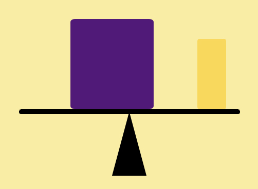
Example 4.
This still life of glass and crystals was set up to show another example of the complimentary colours of blue and orange. No filters were used, the large piece of quartz really is that vibrant orange.
 | |
| Crystals and Glass - blue and orange. ISO 100, f/4.5, 90mm efl, 1/100 sec. |

Here the amount of orange is rather less than the ideal ratio of 1 orange to 2 blue, however this is made up for by its sheer intensity. The eye is initially drawn to the orange and then follows the blue stones down at an angle across the image.

The balance diagram shows the relative amounts of blue and orange, but emphasises that the orange is given extra weight both by its position near the edge and its relative brightness.
No comments:
Post a Comment